Not long ago, Joe wrote about our stay at Disney’s Vero Beach Resort and how our room, which appeared to offer handicapped-accessible accommodations, was so different (which was to be expected) from the previous time we had stayed there, in the same level room, but in a unit that was non-accessible.
The room was a “Deluxe Studio,” which had 1 queen-sized bed, 1 double-sized sleeper sofa and Disney says can sleep up to 4.

Before we go on, I need to give some background: although I’m a travel blogger now, I spent a few decades as an occupational therapist (OT). Hardly anyone ever knows what an OT is, so click here for a brief description. Anyway, part of my job included looking for issues regarding adaptations and accessibility for disabled people. So when I was in what looked like an “accessible” room, my “Spidey senses” went off.
A little more background: handicapped-accessible rooms are required to have certain things in place to deem them accessible and safe. For example, the bottom edge of bathroom mirrors should be no more than 40″ above the ground, grab bars need to be by the toilet and tub, and exposed pipes under sinks need to be padded (so someone in a wheelchair doesn’t hurt their knees on them). Also, doorways and walkways need to be a certain width to allow someone using a wheelchair to have access, and certain spaces, such as a usually-small-in-a-hotel bathroom need to be big enough to have enough room for a wheelchair to turn around.
That required size of the bathroom meant that some of our living room space was made smaller (the accessible room was the same size as a non-accessible room; the footprint was just different because the bathroom was bigger).
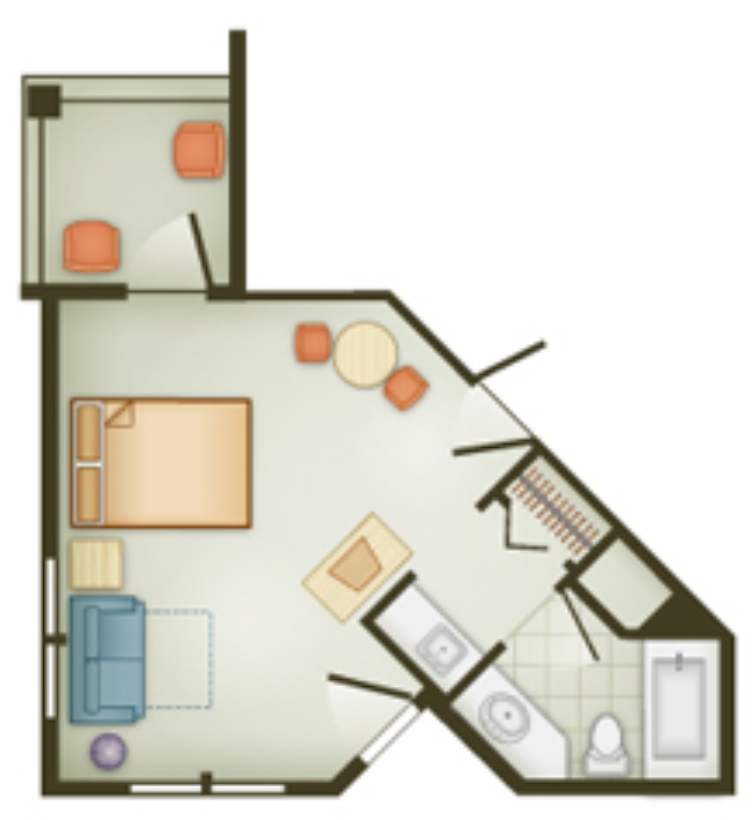
Footprint of non-accessible Deluxe Studio. I could not find a footprint of a handicapped accessible Deluxe Studio // PC: DVC
Unfortunately, the layout of the room means that it wasn’t particularly convenient to anyone – whether they used a wheelchair or not. But I also noticed a design flaw that could potentially make the room VERY dangerous (read: a matter of life or death) for someone in a wheelchair in the event of an emergency.
Joe already went over some of the issues of the room in his post, but here’s my take on a few of them from a “not accessible OR convenient to anyone” point of view:
CLOSET
The closet was one of those things that appeared to have been sacrificed by the bathroom footprint impinging on the living room space.
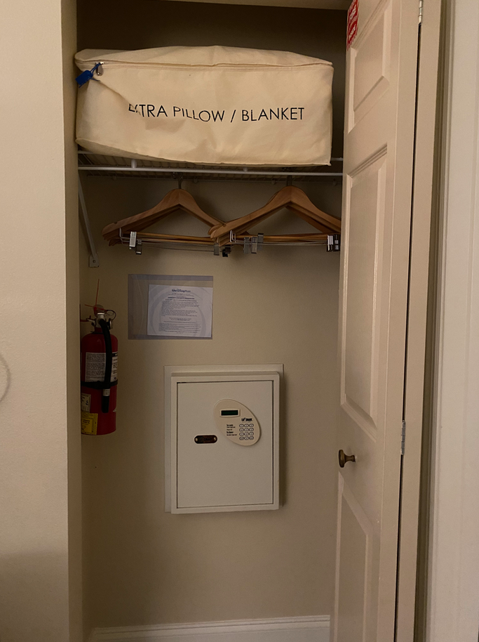
Most hotel room closets are roughly 3 feet deep. This closet was only 9 inches deep (I measured it), so the hangers had to be placed horizontally instead of the typical vertical placement, or the closet door wouldn’t close. That meant you had very little room to hang things and wound up with inconvenient access to the room safe (which you might want to second guess using, anyway). Instead of hanging from the typical clothing rods at the front of the shelving, the hangers were hanging from the one shelf in the closet, under the extra pillow/blanket, which made it REALLY difficult to remove the hangers from the closet (that pillow/blanket combo was heavy!). Plus the whole set up was about 5 feet (60″) off the ground (the height of the shelving is an ADA compliance issue – rods and shelves in the clothes closet or wall-mounted unit within must be 54″ off the floor for a side approach or 48″ off the floor for forward approach – [ADA Stds. 4.25.3])
In other words, inconvenient for everyone, regardless if they were handicapped or not. And it didn’t follow ADA requirements for a handicapped accessible room, to boot.
OTHER STORAGE
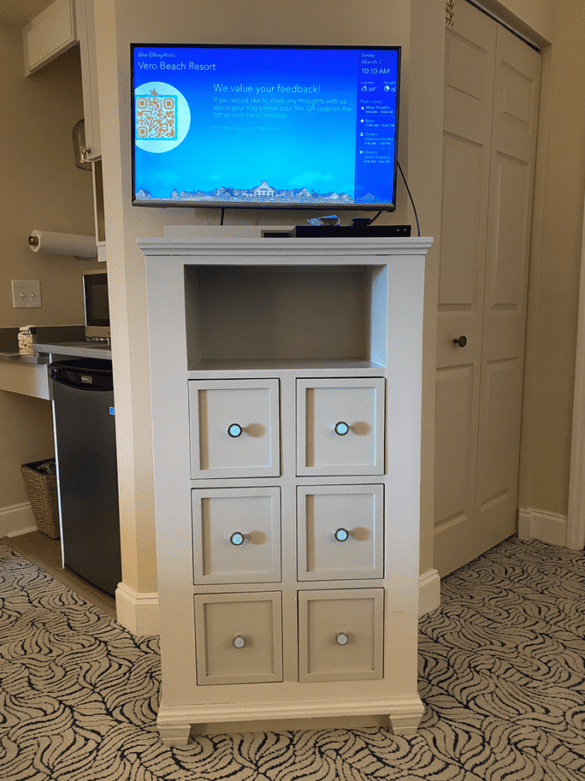
The room was horribly lacking in storage space. In fact, these were the only drawers in the whole studio:
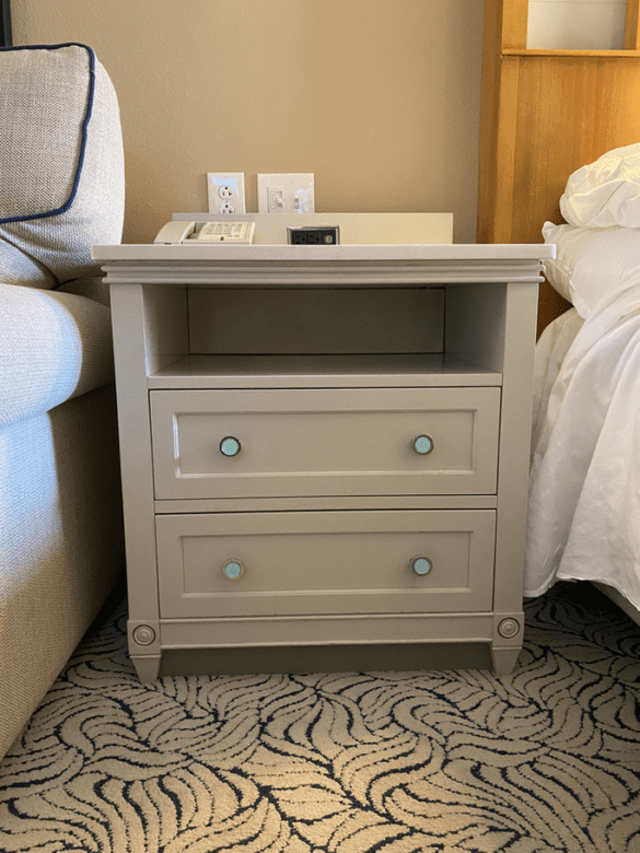
The chest of drawers under the (teeny tiny, itsy bitsy) TV wouldn’t hold anything significant, since they were literally less than 6 inches wide (again, I measured). That left the 2 drawers on the nightstand. All for a room that potentially holds up to 4 people.
In the same level of room that was non-accessible, you got a huge TV and a full 6-drawer chest of drawers.
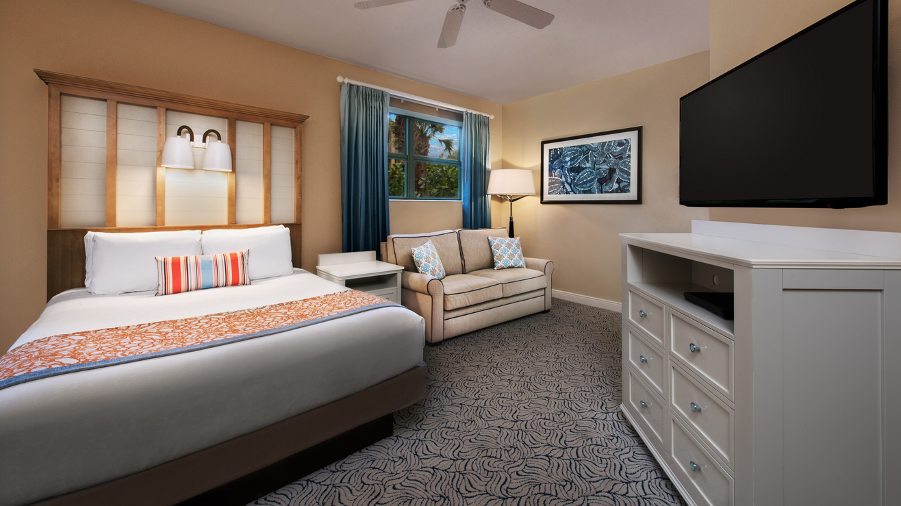
PC: Disney
Joe and I were only there for 2 nights and there were only the two of us, so we just used the (fold-out) couch and the luggage rack for our bags and lived out of our suitcases. But for someone using a wheelchair, a full-sized suitcase on the floor potentially meant less floor space for maneuverability. And if you were a party of 3 or 4 and were using the couch as a place to sleep, it would mean the couch couldn’t be used as a suitcase rack (we also know the hazards of putting a suitcase on a bed or couch and we apologize. Short of putting the suitcase directly on the floor, they pretty much left us no choice in this room).
Granted, more and more hotels are getting rid of drawer space (here’s why). But those that do usually give alternatives. This room has none.
NEED A TISSUE?
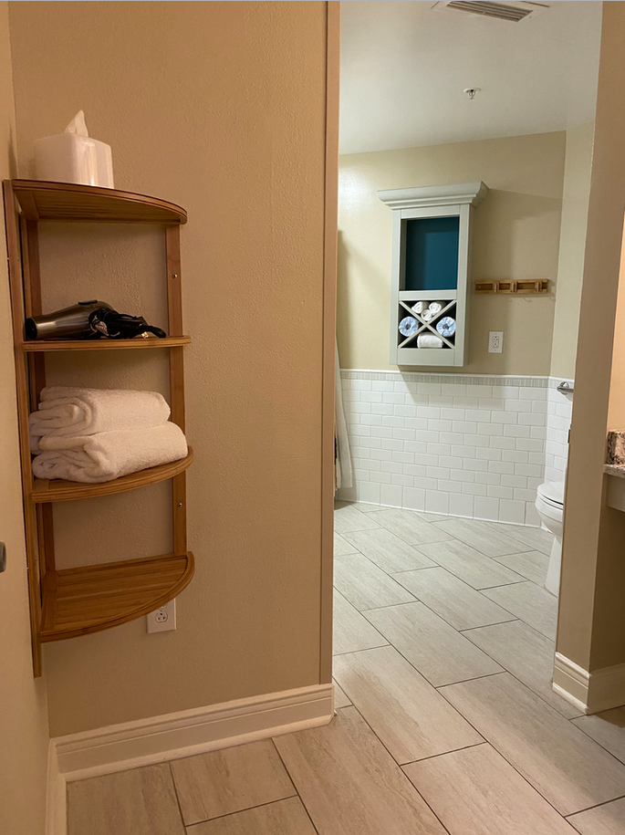
The tissue box was on the top shelf of an oddly shaped 4-shelf rack screwed into the wall (2 of the other small shelves were being used to store the hair dryer and 2 bath towels). The top shelf was about 5′ off the ground, which meant if you wanted a tissue, you had to be able to reach about 6′ up. 4’6″ me couldn’t reach it. Nor could a younger child or someone sitting in a wheelchair.
THE SEATING AREA
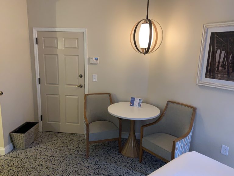
Whereas our non-accessible room had 1 table and 2 chairs, this room only had 1 chair. I could see the potential reasoning behind that – someone who uses a wheelchair already has their own place to sit. But what if they feel like sitting in a typical chair? Or what if the room is being rented to a party that didn’t use a wheelchair (i.e. Joe and me. Or even maybe someone in the party who just used a walker but still wanted a handicapped room for the grab bars)? I guess if they both wanted to eat at the same time, too bad (to say nothing of if you had 3 or 4 people in the room; the table couldn’t hold more than 2 chairs anyway).
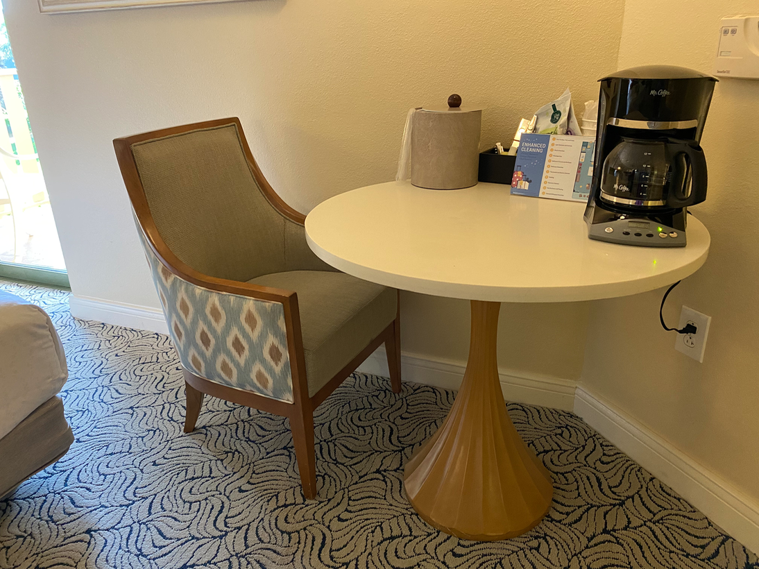
Oh, and that one chair? If it was on the left side of the table (which is where it was when we arrived), it made for an inaccessible fit for someone using a wheelchair if they wanted to go to the room’s patio. Plus, of course, if you’re transferring from a wheelchair to that typical chair, one without arms would have been much more convenient (and, depending on the abilities of the wheelchair user, safer).
We won’t even get into the fact that a third of the table was taken up by a coffee maker, ice chest, cups, coffee, cutlery, etc. That wasn’t the case in the non-accessible room we had stayed in a few months earlier.
THE KITCHEN
Our room was a “Deluxe Studio,” which meant we only had a small space for a microwave, dorm fridge and bar sink (the coffee maker, as mentioned before, was taking up prime real estate on the room’s one and only table).
The microwave was on the counter and the fridge was below it. Both were adequate heights for someone who can stand and walk, and were relatively accessible to someone sitting in a wheelchair. There were cups and cutlery that were already too high for someone using a wheelchair (I guess that’s why they had a secondary set taking up space on the table?), and a closet above that, which, again, would not be reachable by a person of typical height unless they were able to stand up.
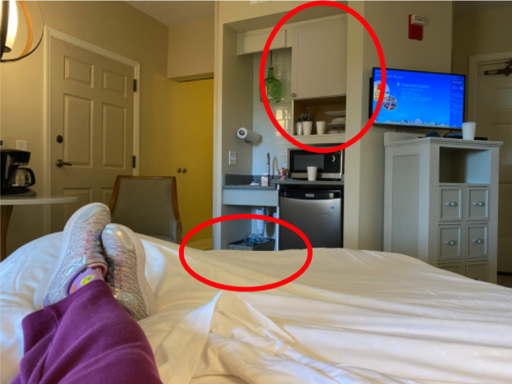
But my favorite was the trash and recyclable cans that were under the sink, which made for limited ability for someone in a wheelchair to have access to the kitchen sink, because their feet would hit the trash can if they tried to use it head on (from the ADA: 4.24.3 Knee clearance that is at least 27 in (685 mm) high, 30 in (760 mm) wide, and 19 in (485 mm) deep shall be provided underneath sinks).
There were a few other issues. There was no transfer bench in the tub (assuming someone can’t stand in the shower, how do they expect them to get into the tub area? And do they expect them to sit on the floor of the tub?). There was also no shower spray unit in the tub; just the regular shower. Both are ADA requirements (4.20.3 and 4.20.6, respectively).
THE POTENTIAL DEATH TRAP
A couple of the things I’ve mentioned were ADA compliance issues that really should be addressed (Disney, are you reading this?). Thankfully, more were just unnecessary inconveniences caused by someone who obviously didn’t know better. I mean, if worse came to worse, even if a guest using a wheelchair was in the room alone, they could move the trash cans under the sink or ask for someone to come to the room and reach the tissue box so it could be moved somewhere else.
However this one other design flaw I discovered is just crazy dangerous, y’all. I mean, I really think that someone could get hurt, if not killed.
The room, as I said earlier, potentially sleeps four. That would be 2 on the queen-sized bed and 2 on the fold out couch/sleeper sofa.
One HUGE problem though – if the sleeper soda is open, there is NO WAY someone using a wheelchair can get past it. Take a look:
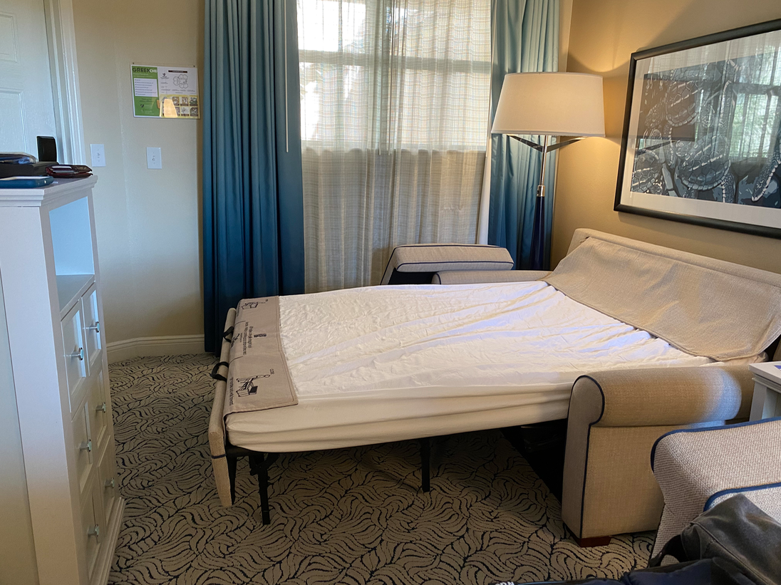
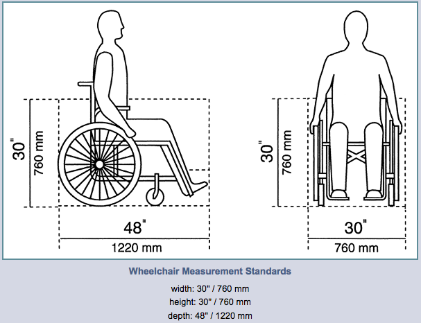
A standard sized wheelchair is anywhere from 18 to 30 inches wide; there is about a foot of space between that chest of drawers and the unfolded sleeper sofa. So in the event of an emergency where an evacuation of the room was required, if someone who uses a wheelchair was anywhere except the entryway of the room, they wouldn’t be able to easily escape the room. And that’s if they could get out at all.
Even if there was another abled-bodied person in the party, that would still mean they’d have fold the bed up to make space for the person in the wheelchair to get out. In the event of a fire or any other emergency, that could take up precious seconds.
Either way, that is as dangerous as hell.
THE CAVEATS
Of course, there are plenty of things we don’t know about this room.
Joe and I are both ambulatory without assistive devices (read: we can walk, and can do so without the use of a cane, walker, crutches, etc.) and didn’t ask for a handicapped-accessible room. Maybe they just don’t give this room to people who use wheelchairs. But if that was the case, why did they have grab bars and maneuvering space in the bathroom, TWO clotheslines in the tub (one 6′ tall, one a wheelchair-friendly 4′ tall), pads on the sink pipes, etc? (and really, the fact that they had another set of cups and cutlery on the table would suggest that someone using a wheelchair had been in the room before and mentioned not being able to reach them).
I suppose it’s also possible that, due to the dangerous inaccessibility when the sofa bed is open, they simply don’t use a Deluxe Studio for parties of 3 or 4 that have someone in their group who uses a wheelchair. But that would bring up whole mess of asking uncomfortably specific questions about why they’re requesting an accessible room (i.e. if they plan on sleeping in the same bed or using the sofa bed, etc.). Also, since Disney’s Vero Beach Resort is oftentimes paid for by Disney Vacation Club points instead of cash, it could potentially put a wrench into their whole “points” system (read: a bigger room would cost more points; do they even do upgrades like that?).
HOW COULD SOMETHING LIKE THIS HAPPEN?
The Americans with Disabilities Act (ADA) guarantees accessibility for those with disabilities. And architects who design public spaces are well aware of the rules they have to follow.
However this Deluxe Studio appears to have two things going on:
A. A company that wants to ensure that a Deluxe Studio is a Deluxe Studio, without any extra space to accommodate a guest (or guests – sometimes people who use wheelchairs marry people who use wheelchairs) who is taking up a space that’s (give or take) 48 inches long and 30 inches wide.
B. A room designer who has no idea of what will work best for someone who uses a wheelchair for mobility.
Y’all, if a room is going to be wheelchair accessible, it needs to focus more on the horizontal plane, rather than height (the tissue box, closet hangers, etc.). It should also have a footprint that would be accommodating to and safe for someone using a wheelchair, regardless of whether or not the sleeper soda was used (either that or say the wheelchair accessible rooms can only hold 2 people, and get rid of the sleeper sofa). The space would include having 2 chairs (one being easy to transfer to would be nice), a usable closet, drawer space (or an alternate for same), a TV that was larger than a computer monitor, and enough space so everything could be reached without giving up table space or having to put tissues on the top shelf.
Instead, although the room’s footprint is changed, the same 350 square feet are being used, along with most of the same furniture as in any other room. It’s making for a room that’s inconvenient for ANY guest, as well as a potentially deadly situation for those who the room was designed for in the first place.
Want to comment on this post? Great! Read this first to help ensure it gets approved.
Like this post? Please share it! We have plenty more just like it and would love it if you decided to hang around and get emailed notifications of when we post. Or maybe you’d like to join our Facebook group – we have 20,000+ members and we talk and ask questions about travel (including Disney parks), creative ways to earn frequent flyer miles and hotel points, how to save money on or for your trips, get access to travel articles you may not see otherwise, etc. Whether you’ve read our posts before or this is the first time you’re stopping by, we’re really glad you’re here and hope you come back to visit again!
This post first appeared on Your Mileage May Vary

2 comments
The solution might be to either remove the sleeper sofa or place a warning that sleeper sofa use is prohibited if the room is occupied by someone in a wheelchair.
Hotels in New York City tend to be small and cramped.
Good catch!