Unless you’re in “the business,” you probably don’t put much thought into why certain places are designed the way they are.
- Restaurant logos use a lot of red, orange and yellow because those colors have an effect of appetite stimulants
- The restrooms in Disney parks around the world are designed to make the flow of traffic go faster
- Modern-day hotel lobbies often have the restaurants/bars in the open (or at least nearby) to entice you to buy there, and to make it easier for staff, who sometimes work double duty.
- We’re admittedly still not sure what this hotel designer had in mind with (s)he made this decision?!?!?
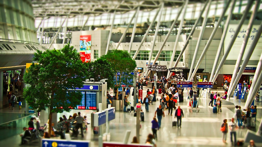
But sometimes building designs go way beyond the obvious and focus on the subconscious things that help us make decisions. Airports are a prime example. Take a look:
I had no idea about a bunch of those; how about you?
Want to comment on this post? Great! Read this first to help ensure it gets approved.
Want to sponsor a post, write something for Your Mileage May Vary, or put ads on our site? Click here for more info.
Like this post? Please share it! We have plenty more just like it and would love it if you decided to hang around and sign up to get emailed notifications of when we post.
Whether you’ve read our articles before or this is the first time you’re stopping by, we’re really glad you’re here and hope you come back to visit again!
This post first appeared on Your Mileage May Vary
Join our mailing list to receive the latest news and updates from our team.

