It’s not hard to guess from the title that one of my travel pet peeves is related to water, specifically falling water. In other words, hotel showers.
It’s true that showers can have many issues that will annoy even the most patient guests. The curtain may stick to you while you’re taking a shower. The shower may have insufficient lighting, making it feel like you’re showering in a closet. Poor waterproofing or design can leave the bathroom floor, including mats and clothes, soaking wet. The location of the shower controls might also require you to be in the water’s path to turn it on.
I had a totally different problem with one shower I encountered. With this shower, I just couldn’t figure out how to turn it on.

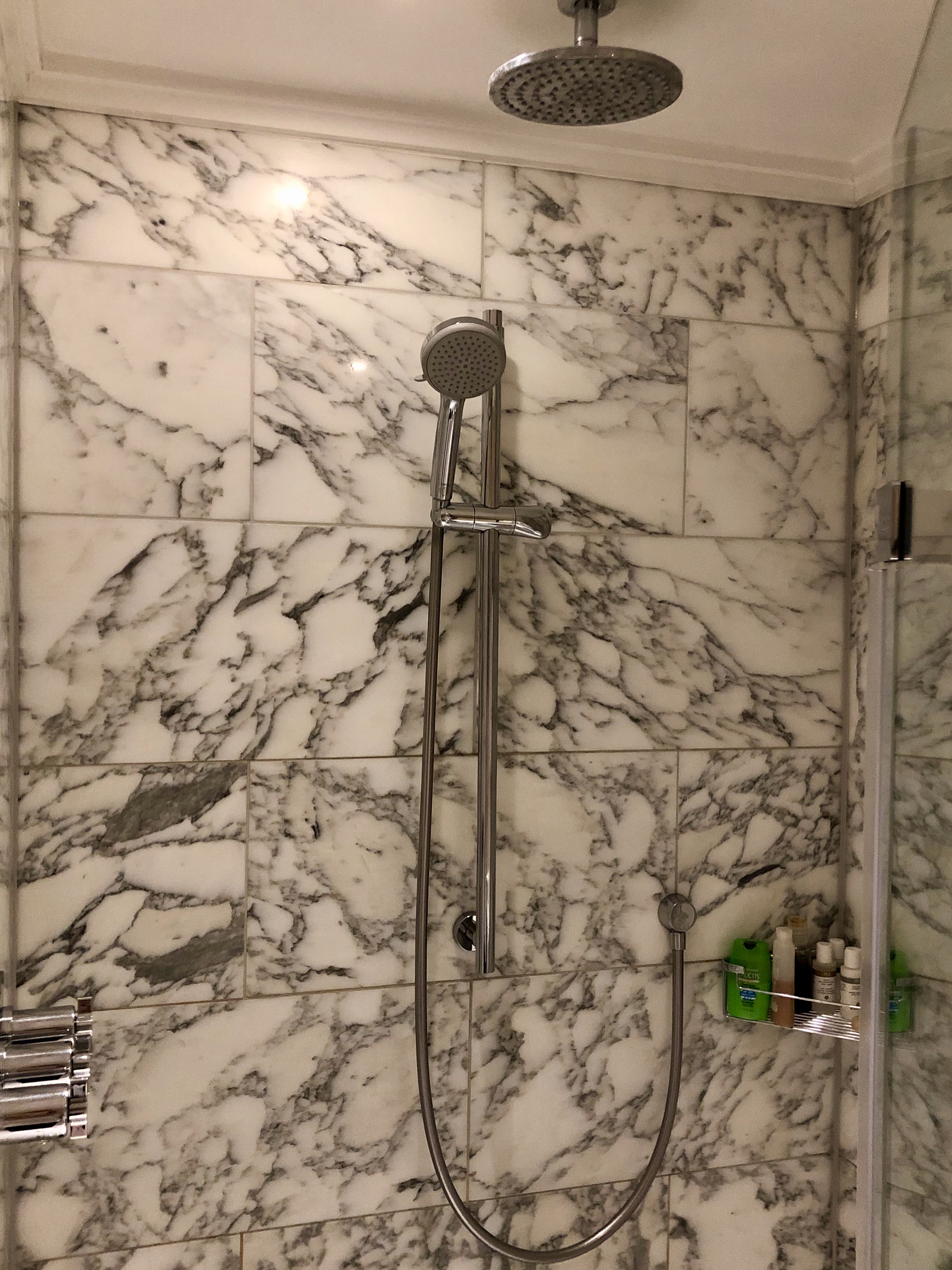
The shower in this room was very nice, if a little small for a junior suite. There was both a rain shower head and a hand shower, which I always appreciate. At first glance, this shower looks simple enough, right?
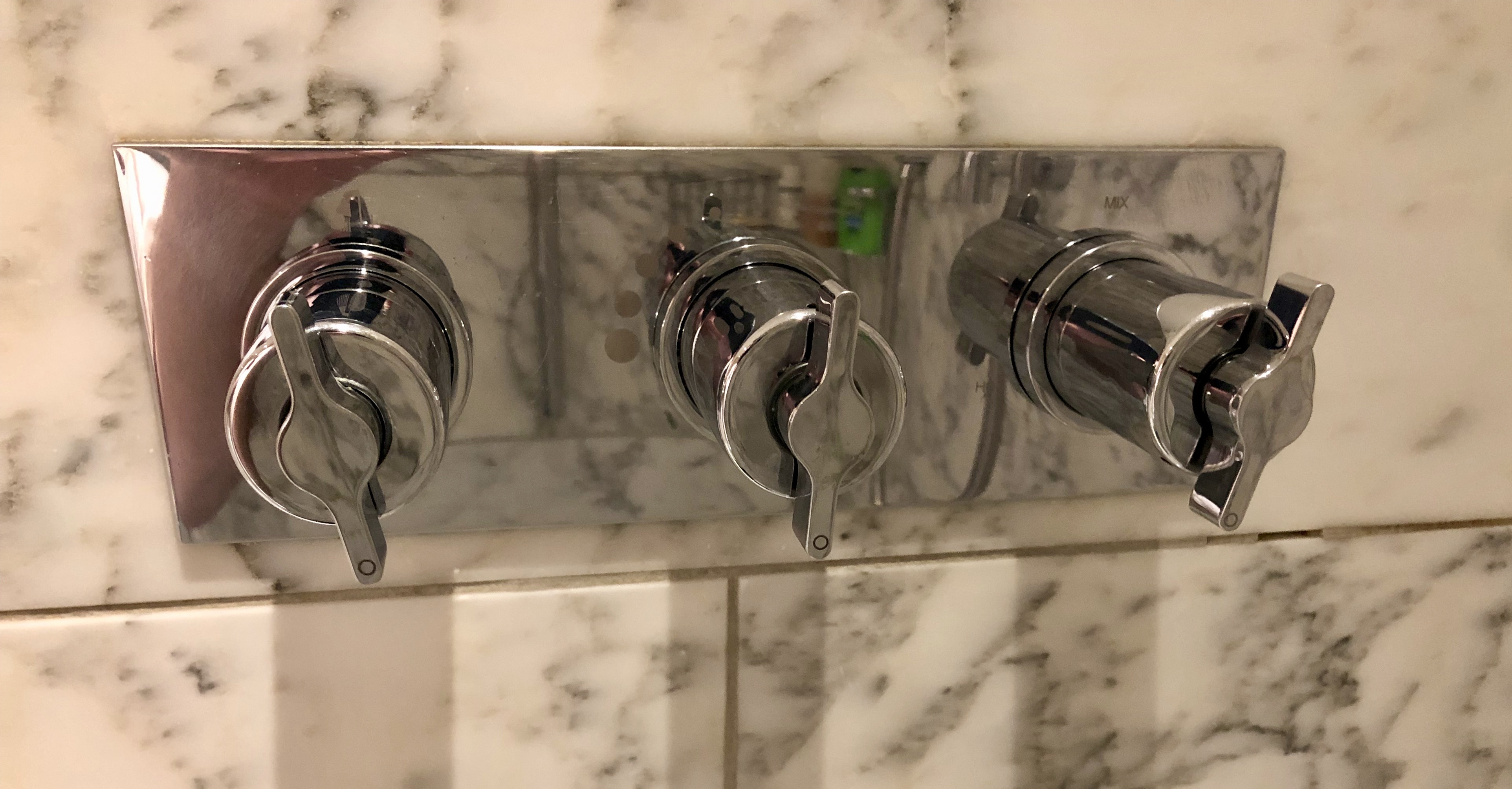
I woke up after my first night of sleep and in my morning pre-coffee grogginess, I was presented with these controls.

Ah, the infamous shower dials! It’s like playing a game of roulette every time you step in. You have no idea what each dial does, and if you get it wrong, you’re either going to feel like you’re in a sauna or stuck in the North Pole. And let’s be honest, no one wants to be the person who screams like a maniac in the shower, trying to avoid the cold water droplets hitting them in the face.
But hey, if you’re feeling lucky, go ahead and take a guess! Who knows, maybe you’ll hit the jackpot and get the perfect temperature. Or, you might end up looking like a red lobster or shivering like a penguin. The choice is yours!
Here’s the answer. The knob on the left is the on/off valve. The middle knob is a toggle between the handheld and the rain shower heads. The right knob is for temperature control.
How did I find this out? By trial and error, and that’s just not right. How come hotels can’t either label each knob or give instructions? I had one hotel, I think a Moxy, that put the shower instructions on the glass shower door as a decal, which I think is a great way to solve this problem.
There’s another solution to this problem – stop installing shower knobs that are so confusing that no one can figure out how to use them!!!!!!!!
Want to comment on this post? Great! Read this first to help ensure it gets approved.
Want to sponsor a post, write something for Your Mileage May Vary, or put ads on our site? Click here for more info.
Like this post? Please share it! We have plenty more just like it and would love it if you decided to hang around and sign up to get emailed notifications of when we post.
Whether you’ve read our articles before or this is the first time you’re stopping by, we’re really glad you’re here and hope you come back to visit again!
This post first appeared on Your Mileage May Vary

3 comments
That is why in cases like this you stand outside the shower/tub trying out the options
Might be customary in their Country.
Beware of a string or cord hanging near the tub. I pulled it while in the Nicolaus Bari and immediately got a phone call inquiring whether I was OK. They explained this cord was for emergencies such as a fall in the tub. I was young and American and their first guess was that I was OK but confused.
If you can’t intuitively figure out how to use it, the design is bad. A sign telling you how to use it is an indication that the designer has failed. While Moxy’s solution is better than nothing, it would be better still if you could figure it out automatically without any instruction. Think about how often you see doors that have signs that tell you “push” or “pull.” Or worse have nothing, so that you pull when you should really push. The door handle should communicate without words whether you need to push or pull. The same can be done with a shower – and it doesn’t cost anything extra. This is a huge pet peeve of mine also.