If you’re old enough to remember life before GPS, you remember maps. Back in the day, they were THE way to get from Point A to Point B, C, D and beyond. Nowadays we have the likes of Waze, Apple Maps and Google Maps to help us travel. But there are still plenty of good maps out there that help illustrate a point.
Sometimes you’ll see a map – maybe that has to do with statistics, or a survey – and you wind up really studying the results because you get so interested. Early this year, I posted a piece about 15 maps that would blow your mind. There are plenty of other maps out there that are just as interesting; here’s a bunch of them:
The maps
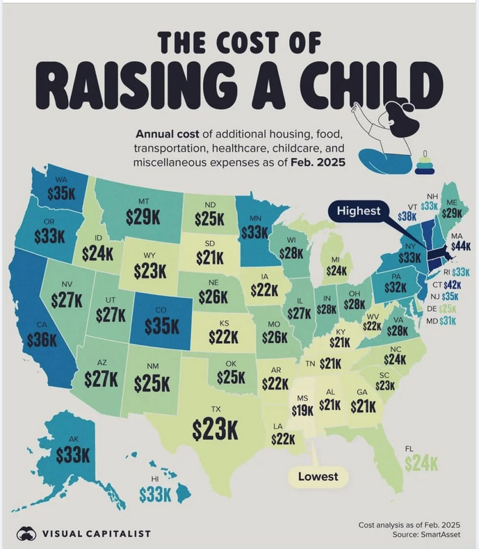
The cost of raising a child
It costs a lot to raise a kid. But it costs a whole lot more in some states than in others – more than twice as much, depending on the state. These figures are from February 2025.
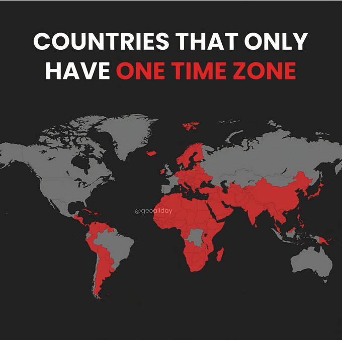
Countries that only have one time zone
The continental U.S. has 4 time zones, but there are plenty of countries that only have one time zone – either because they’re “that small,” or simply because they prefer it that way. More information and explanations here.
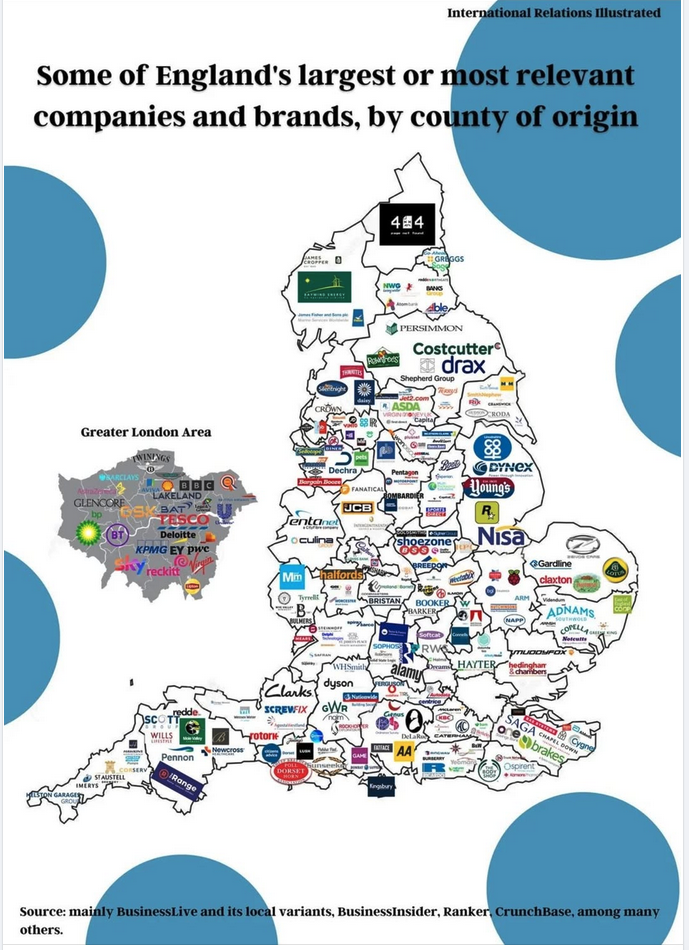
Largest/most relevant companies in the UK
When you think of “the largest or most relevant companies that are in the UK,” you probably think of places like the BBC (news), Tesco (supermarket), or Clarks (shoes). Here’s a map that shows those, and a whole lot more, thanks to International Relations Illustrated:
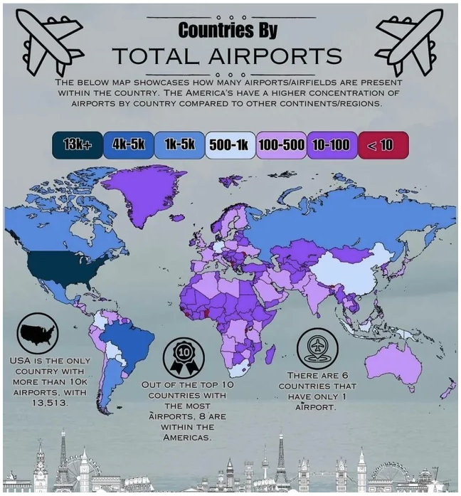
Countries by total number of airports
Is anyone surprised that the U.S. has the most?
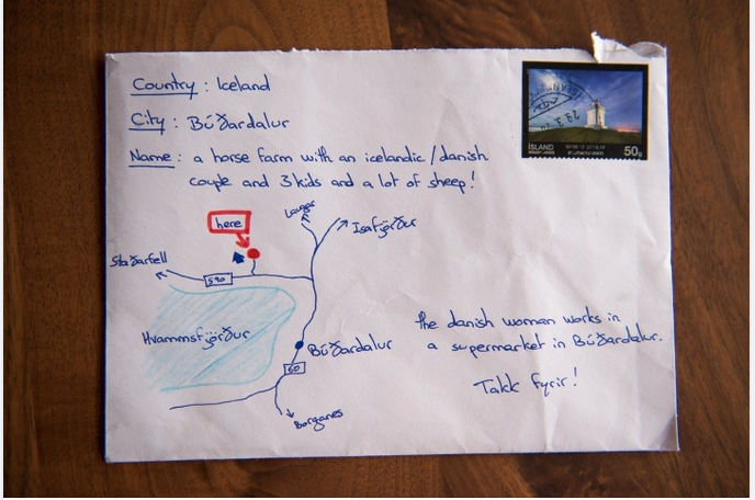
The map that worked as a mailing address
This one has made the rounds on the internet for years. The letter apparently made it to its intended Icelandic address, and that still makes me smile.
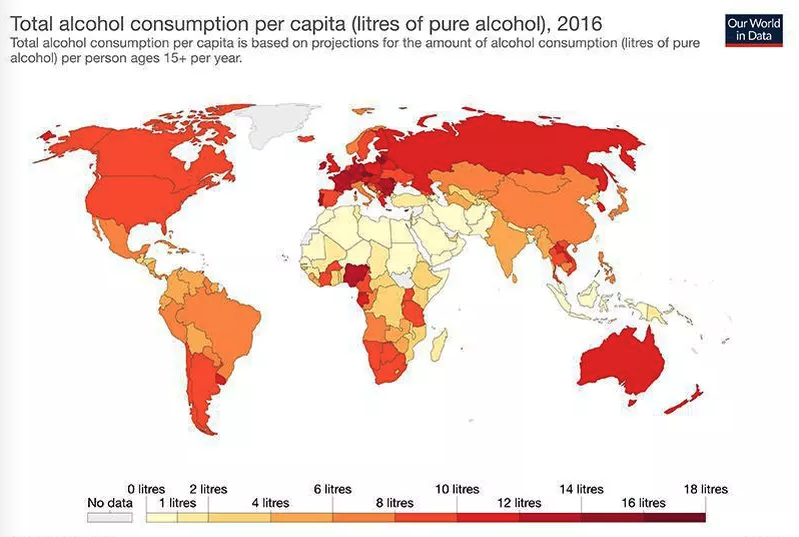
Total alcohol consumption per capita (liters of pure ETOH)
Granted, this map reflects data from 2016, but I can’t think that it’s changed ALLLLL that much. Thanks to Our World in Data for the information:
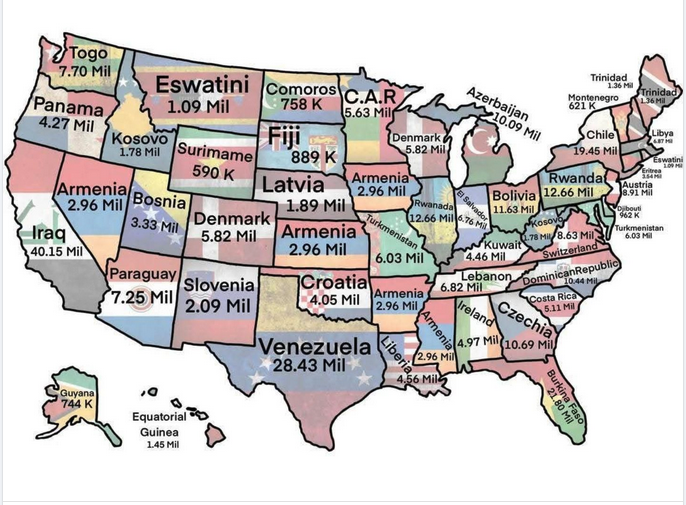
U.S. states & which country has the most similar population
Fun fact! Venezuela has roughly the same population as Texas!
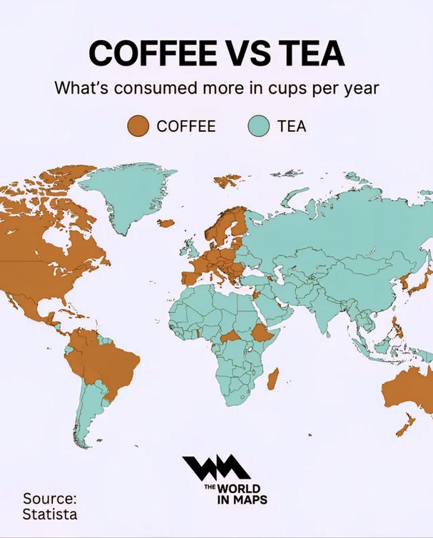
Coffee vs. tea drinkers
Which countries drink more coffee, and which drink more tea, according to Statista (H/T to The World in Maps).
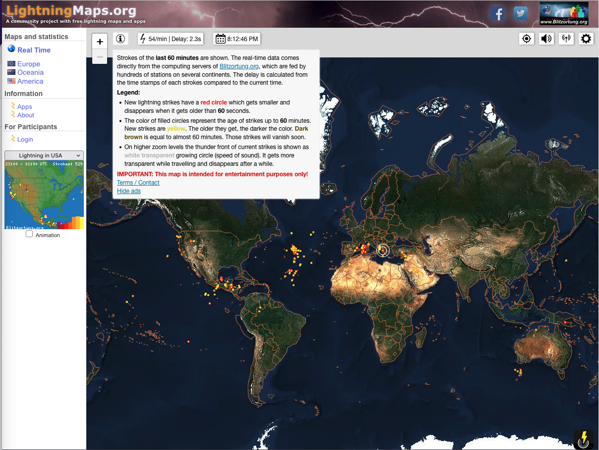
Real time map of lightning strikes around the world
When I discovered this map, I thought it was fascinating. The screenshot gives you an idea of what you’ll see, but click here to see for yourself!
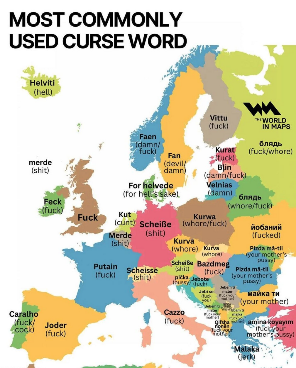
Most commonly used curse words in Europe (NSFW)
Because it’s always good to know some words the locals use… 😉
Fair warning: this one is NSFW, due to adult language. We saved it for last, so if you choose not to have it on your screen, you won’t miss anything after it.
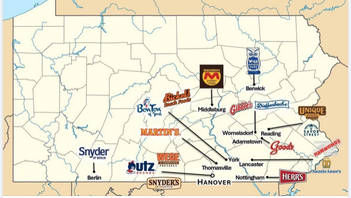
Feature image: The Pennsylvania homes of companies you’re probably very familiar with.
Want to comment on this post? Great! Read this first to help ensure it gets approved.
Want to sponsor a post, write something for Your Mileage May Vary, or put ads on our site? Click here for more info.
Like this post? Please share it! We have plenty more just like it and would love it if you decided to hang around and sign up to get emailed notifications of when we post.
Whether you’ve read our articles before or this is the first time you’re stopping by, we’re really glad you’re here and hope you come back to visit again!
This post first appeared on Your Mileage May Vary
