We’ve all been there.
Your flight gets delayed. Then delayed again. Then, if you’re really lucky, it gets canceled altogether.
Or maybe you’re watching one of those airline meltdowns unfold—whether it’s Southwest, Delta, Newark, Chicago or somewhere else—and wondering, “What on earth is going on?”
Of course, if you have the “right” apps (these are some excellent ones) and enough travel experience, you can usually figure out why delays and cancellations are happening. But sometimes you don’t want to play aviation detective. You just want someone to show you the big picture.
That’s exactly where one of FlightAware’s lesser-known tools comes in.
If you’re an aviation geek, you’ve probably heard of FlightAware. If you’re not…here’s the 10-second version: FlightAware is the world’s largest flight tracking platform. From FlightAware’s “About” page: “With global connectivity to every segment of aviation, FlightAware provides over 10,000 aircraft operators and service providers as well as over 13,000,000 passengers with global flight tracking solutions, predictive technology, analytics, and decision-making tools.”
If you look at FlightAware’s front page, the top bar has an option for “FLIGHT TRACKING.” Click on that, then click on “FLIGHT TRACKING” again (it’s now on the left-hand side of the screen), and you can see what’s going on, around the world, in terms of flights. To be honest, that can be pretty overwhelming when you’re talking about 10,000+ flights at any given moment.
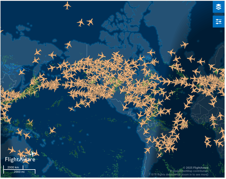
And frankly, it still won’t help you know why your flight is so delayed.
But…tucked away in the depths of FlightAware is a page that explains it all. And the title of it is….well, it’s just perfect.
Misery Map
I have to admit – although FlightAware’s Misery Map is new to ME, it’s not new at all. In fact, it’s been around since at least November, 2013 (and potentially even earlier; Nov. ’13 just the earliest reference I could find of it).
But the Misery Map is cool because it’s an interactive map that shows how things are going at major transportation hubs across the U.S. In real time, it tells you how many flights were recently canceled or delayed (highlighted in red) and how many are proceeding as scheduled (highlighted in green).
At the time I checked, it showed 17 major transportation hubs across the U.S., covering 30 airports.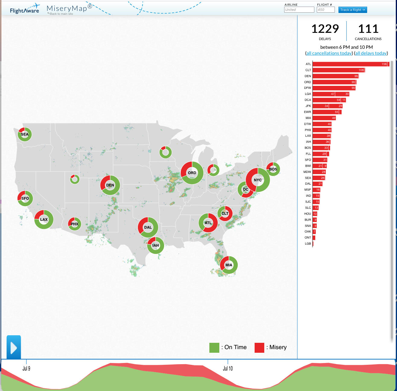
You can also click on each hub to see how the airports in that hub are doing. In the example below, clicking on NYC showed 136 delayed flights in the area, including 30 at LGA, 29 at JFK and 55 at EWR.
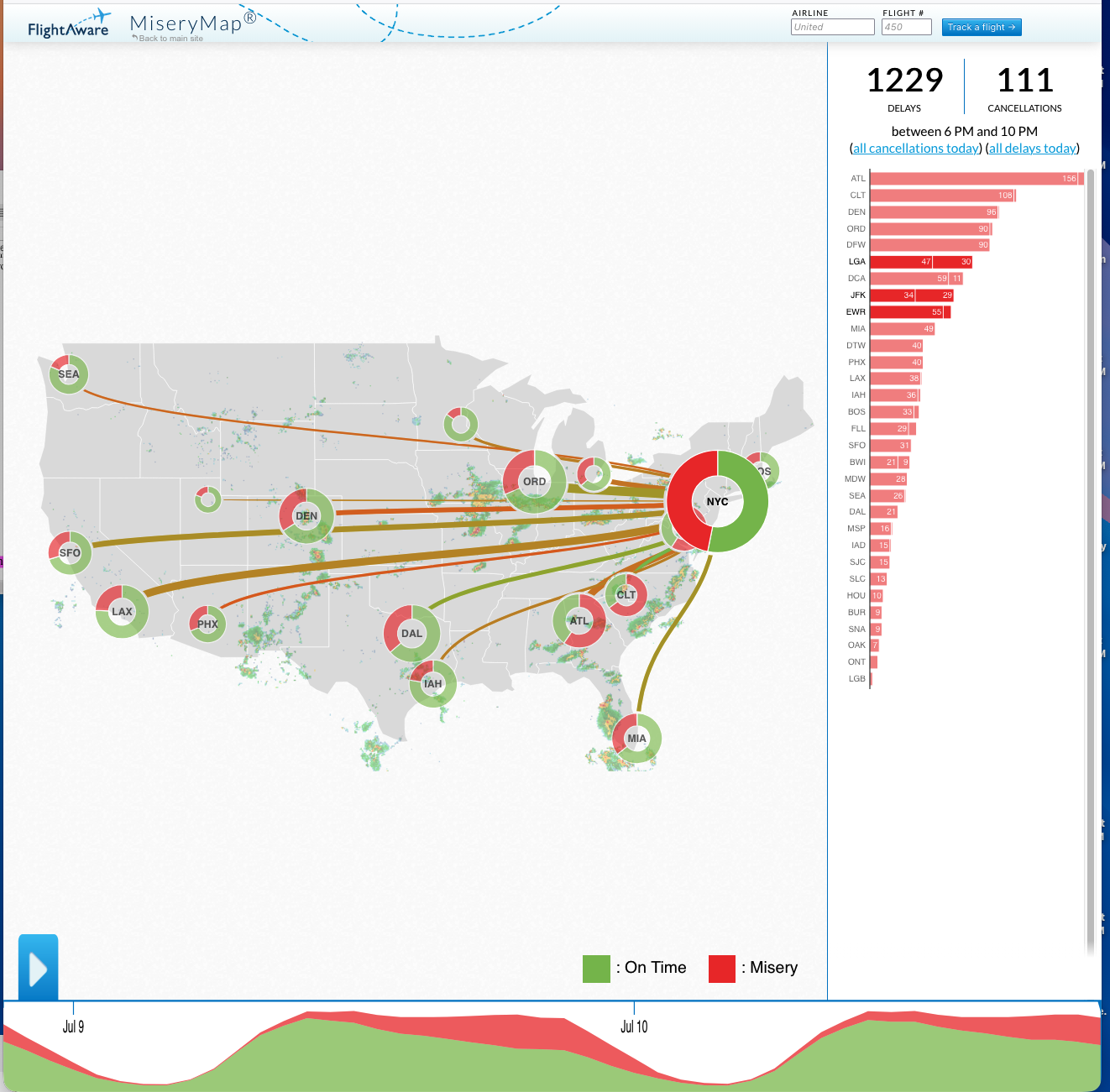
I also like that they superimpose weather onto the map, which makes it easy to see that, for example, DEN’s delays might be because of the adverse weather going through the area.
FlightAware’s Misery Map also allows you to see the pattern of delays across the country over the previous 48 hours. You just move your cursor to where you want it to start, click the blue arrow, and you’ll see a short video of what’s happened at the hubs.

It’s one of those tools that’s almost addicting once you know it exists.
The Misery Map isn’t going to magically get your delayed flight back on schedule.
But it will tell you whether your problem is just your flight…or whether half the country is having the exact same miserable day.
And honestly? Sometimes knowing you’re not the only one sitting at the gate wondering what’s going on makes the waiting just a little easier.
Want to comment on this post? Great! Read this first to help ensure it gets approved.
Want to sponsor a post, write something for Your Mileage May Vary, or put ads on our site? Click here for more info.
Like this post? Please share it! We have plenty more just like it and would love it if you decided to hang around and sign up to get emailed notifications of when we post.
Whether you’ve read our articles before or this is the first time you’re stopping by, we’re really glad you’re here and hope you come back to visit again!
This post first appeared on Your Mileage May Vary